Chocolate wrapper | Coffee etc.


This chocolate bar is closely linked to the city of Dordrecht. It is made with sheeps milk relating to an old story that people from Dordrecht are also called 'schapenkoppen' (sheep heads). The wrapper is decorated with typical elements from the city of Dordrecht. Its' colour red is combined with the colours of Coffee etc. and a rich chocolaty brown to form a tasty packaging.

© 2010 Making Waves

Identity | Ontrack


Ontrack is about combining two different components: music and video productions as well as cultural and corporate clients. The logo plays with this fact. Two sections form a stylized 'O'. The yellow pattern based on the logo visualizes the recording process and analogue sound tracks. Together with the powerful colour yellow and the UV varnish finish the identity visually supports Ontrack's aim of providing high (analogue) quality with modern means.


© 2010 Making Waves

Campaign | Tong Tong Fair


This year special attention is paid to the fair's recent new name 'Tong Tong' which used to be 'Pasar Malam Besar'. The playful typography is built from elements as used in the entire identity. A combination with warm and welcoming portraits of indo's at the fair reflects the mix of eastern and western culture and the three elements of the Tong Tong Fair: food, fair and festival. (Portrait photography by Frank Ruiter.)

© 2010 Making Waves

Jubilee Invitation | Johanniter Orde


The Johanniter Orde Nederland will celebrate their 100th anniversary this November. For this special occasion I designed a festive and cheerful invitation card which will be sent to the dutch queen and other exclusive guests.

© 2009 Making Waves

Breda's Museum Identity | at Dutch Database Expo
(Graphic Design Museum, Breda)


The identity for Breda's Museum is displayed at the newest exhibition 'Dutch Design Database' of the Graphic Design Museum in Breda, which opened last weekend.

'Dutch Design Database is een tentoonstelling en tegelijk een database in ontwikkeling over de professionalisering van het ontwerpvak in Nederland vanaf 1945. Het museum verzamelt digitaal beeldmateriaal voor onderzoek en presentatie en draagt bij aan de discussie omtrent digitaal erfgoed. In de tentoonstelling ervaart de bezoeker het werk en de feiten, cijfers en ontwikkelingen van het vakgebied op een fysieke manier.' — Graphic Design Museum, Breda

© 2009 Smidswater / Christina Schürmann

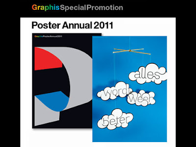
Alles wordt weer beter | Crisis poster
Veenman Drukkers


Keep on dreaming — everything will be better.

© 2009 Christina Schürmann

Tegen de stroom in | ICTRegie


This book is about making the Dutch aware of their influence in ICT.
The mix of informative and colourful graphic design appeals to scientists as well as students. Powerful infographics, a smart navigation and a complete illustrated overview of ICT milestones make this book
fun to read.

© 2009 Created at Smidswater

Ceiling lamp | Smidswater


I designed this lamp for the new interior of Smidswater resembling the vertical structure of typical old lamp-shades.

© 2008 Created at Smidswater

Show your typeface | Graphic Design
Festival Breda


The unique t-shirt designed for sale on the Graphic Design Festival in Breda is produced in a limited editon. ‘Show Your Typeface’ appeals to designers as well as the general public with its ambiguous statement.

© 2008 Smidswater

Portrait of a Person or Portrait of the City | Studytrip of AKI ArtEZ academy


This intercultural project of the AKI academy from Enschede and Bilgi university from Istanbul resulted not only in visual works, inspiration and exchange of opinions but also in a steady contact between the two art academies. As Project Manager I was as well responsible of finding a partner academy in Istanbul as filling in the programme of the studytrip and the assignment for the students.

© 2006 AKI ArtEZ Academy

Worringer Platz | Documentary about public space


‘Am Worringer’ is an honest en inspiring documentary about one of Düsseldorf’s most troublesome public spaces. The ‘Worringer Platz’ is portrayed by various different opinions coming from architects, transport experts, city planners and artists as well as local residents and passers-by. Like the opinions the typography is sometimes rough and monumental and sometimes quiet. As the Worringer Platz is continiously changing this is illustrated by the pictures in the book being used as fragments to give you a feeling of place and time. Overview is created by a historical chronology and a walking route as a red line.

© 2005 Christina Schürmann

Corporate Identity | Breda’s Museum


The Breda’s Museum hosts a great variety of art pieces on the history of Breda. The museum itself can only put some of these items on public display. Their new identity was developed with the idea of presenting a platform for all the (forgotten) pieces from the archive.
A visual style is created with the white stencil logo as a framework for the diverse and colourful pieces of art.

© 2008 Created at Smidswater